Color Palette From Image: Free Extraction Guide
Quick Answer: A free color palette from image workflow turns a photo, screenshot, logo, or product shot into usable hex colors. Upload the image to a color palette from image tool and pull 4 to 6 main colors. Then test contrast and assign colors to roles like text, background, button, link, and accent. Word Spinner offers a free random Color Palette Generator for quick website palette planning after color palette from image extraction.
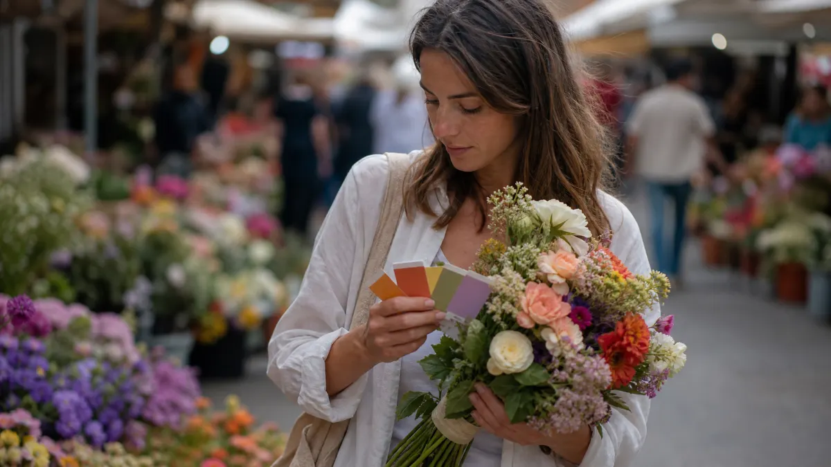
Images give you faster color direction than a blank picker. The useful result is not just a pretty row of hex codes. It is a small, tested color set for a landing page, brand kit, ad, email signature, or product UI.
What is a color palette from image?
A color palette from image is a set of colors pulled from the visible pixels in a photo, screenshot, drawing, or logo. The tool reads the image, finds repeated or main hues, and returns values such as hex, RGB, or HSL.
For website work, treat that color palette from image output as raw material. A beach photo might produce sand, sky, navy, coral, and white. Those colors still need jobs before they belong in a real interface.
Use one color for the main action, one or two for backgrounds, one for borders, and one for small accents. Keep body text separate unless the extracted color already passes contrast testing.
How does a free color palette from image tool work?
A free color palette from image tool samples pixels, groups similar colors, and removes near-matches. The output often favors large areas. That is why a photo with a blue sky may produce several blues unless the tool balances color strength and brightness.
According to Adobe Color, Adobe Color can create themes with up to ten colors and extract themes from images. Coolors lists an Image Picker for pulling colors from photos. It also lists a Contrast Checker for text-background ratios.
That color palette from image process works well for first drafts. It does not decide which color should become your CTA. It also does not choose the text background or the darker shade. You make those decisions after extraction.
| Workflow | What the tool gives you | What you still decide | Best use |
|---|---|---|---|
| Photo upload. | Dominant image colors. | Which colors are usable for text and actions. | Brand moodboards, product campaigns, website refreshes. |
| Manual picker. | Exact sampled pixel colors. | Which samples represent the image best. | Logo matching, illustration matching, detail work. |
| Harmony generator. | Related shades and complements. | How strict the palette should feel. | Building support colors after extraction. |
How do you create a free color palette from image?
To create a free color palette from image, start with a clean image that fits the mood you want. Product photos, hero images, room shots, and brand photos work better than cluttered screenshots. The tool gets clearer color signals from them.
- Choose a free image extractor such as Adobe Color or Coolors Image Picker.
- Upload one image that matches the page, campaign, or brand asset you are designing.
- Extract a short palette, ideally 4 to 6 colors.
- Remove duplicate shades that do the same job.
- Assign each remaining color to a role: background, surface, heading, body text, button, link, accent, or border.
- Check each text and button pairing against WCAG contrast rules.
- Use the free Word Spinner Color Palette Generator only for extra random palette ideas, not image extraction.
Use fewer colors than the color palette from image tool gives you. Five useful colors beat twelve decorative colors. Every extra choice gives the design another place to drift.
Which tools can extract colors from images?
Adobe Color and Coolors Image Picker can support color palette from image extraction. Word Spinner’s current free Color Palette Generator is different. It creates random 5-color hex palettes and supports quick copying, so use it after extraction for ideas.
| Tool | Strength | Weakness | Use case | Price |
|---|---|---|---|---|
| Adobe Color. | Extracts themes from images and supports color harmony rules. | Best results still need role mapping outside the tool. | Creative theme exploration and Adobe workflow handoff. | Free web app available. |
| Coolors Image Picker. | Extracts colors from photos and pairs well with contrast checks. | Some workflow features point users toward account or paid paths. | Designers who want quick palette variations and preview tools. | Free and paid options. |
| Word Spinner Color Palette Generator. | Fast random 5-color hex palette planning. | Does not currently extract colors from uploaded images. | Extra inspiration after image extraction. | Free. |
According to Coolors, its tools include an Image Picker for extracting colors from photos. Coolors also lists a Contrast Checker for text-background ratios. That pairing matters because color palette from image extraction alone cannot tell you whether a color works for readable UI.
How do you choose the right colors after extraction?
Choose color palette from image results by role, not by preference. A color can look beautiful in a photo and still fail as a button, link, or text color.
Start with background and text because readability controls every other choice. Then choose one action color that stands out from the background. Save bright colors for small accents, not large page sections.
Here is the practical rule: if a color needs paragraphs of explanation to work, remove it. Good palettes are easy to explain because each color has a job.
“A useful image palette is a role map, not a souvenir from a photo.”
A color palette from image workflow works best when you separate extraction from approval. First, let the color palette from image tool find candidate colors from the photo. Next, cut the list to a tight set that can support real interface roles. Last, test the pairings in the exact place where they will ship.
A warm tan from a product shot might work as a card background, but fail behind small gray text. A deep navy might work for headings, but feel too heavy as a full hero background. Treat every pulled color as a candidate until it passes contrast, visual order, and brand-fit checks in the real layout.

How do you check contrast before using the palette?
Contrast turns a pretty color palette from image into a usable one. According to W3C WCAG, normal text needs a contrast ratio of at least 4.5:1 for Level AA. Large text needs at least 3:1.
Test every key pairing: body text on background, heading on background, button text on button color, link text on page background, and form labels on input areas. Do not rely on eyesight alone.
If a color fails, darken or lighten it while keeping the same hue family. You can keep the color palette from image mood without shipping text people cannot read.
How do you turn a color palette from image into website roles?
Turn a color palette from image into website roles by building a small token set. Tokens keep the palette steady across pages, emails, and content assets.
Use names that describe jobs instead of colors. `–color-action` tells a future editor more than `–blue-500`. If the action color changes from blue to green later, the role name still makes sense.
A simple website set can include:
- Page background.
- Surface background.
- Primary text.
- Muted text.
- Primary action.
- Link.
- Border.
- Accent.
- Error or warning.
After your palette is set, save it near your content workflow. The free Color Palette Generator guide explains how website palette choices connect to buttons, backgrounds, and brand assets.
What mistakes should you avoid with image palettes?
Avoid using every color palette from image result. Image tools often return close variants because photos contain shadows, highlights, and file noise.
Do not set body text in a low-contrast accent color. The W3C contrast target exists because many users cannot read faint text with ease, even when the color looks refined in a mockup.
Do not use the same accent for every UI state. Links, buttons, warnings, and success messages need distinct visual cues. Keep the palette small, but not vague.
Do not skip technical cleanup after a design refresh. If a new palette ships with updated templates, use the free XML Sitemap Validator workflow to catch crawl issues after URL, template, or meta changes.
How can a palette from image support SEO and conversion?
A palette from image can support SEO and conversion by making the page easier to scan before users read the copy. A clear action color helps visitors see where to click. Readable text colors keep them on the page long enough to judge the offer.
Keep copy stable when testing color changes. If you change the headline, button text, and palette at the same time, you will not know which change affected conversion.
Use the color palette from image for visual consistency, then use SEO tools to choose what you publish next. The free Keyword Difficulty Checker workflow can help you choose easier terms after your design system is ready for more pages.
How should you save and hand off the final palette?
Save the final color palette from image as hex values, role names, and usage notes. Include one approved text-background pair and one approved button pair so the next person does not guess.
Hand off the palette with examples: hero, card, form, table, CTA, and alert. A color system is easier to follow when people can see it in real page states.
Turn Palette Ideas Into Publish-Ready Content
People Also Ask
What is the best free way to get a color palette from image?
The best free way is to upload a clean image to a color palette from image extractor, then reduce the output to 4 to 6 useful colors. After extraction, test the colors for contrast and assign each one a clear role before using them on a website.
Can AI pick website colors from a photo?
AI and image tools can suggest colors from a photo, but they should not be the final approval step. You still need to check readability, brand fit, and CTA contrast in the page layout where the colors will appear.
Are hex colors from an image accurate?
Hex colors from an image can be accurate for sampled pixels, but main-color extraction is still a reading of the image. Light, file size, shadows, and cropping can all change which colors the tool returns.
Should I use every color an image palette tool gives me?
No. Most color palette from image outputs include near-match shades, so keep only the colors that have a useful job in the design. A tighter palette is easier to use across buttons, backgrounds, links, and text.
Frequently asked questions
Can you create a color palette from image with any photo?
Yes, but the image quality affects the output. Clear photos with a strong subject and balanced light usually produce cleaner palettes than blurry screenshots or cluttered collages.
How many colors should you extract from an image?
Start with 4 to 6 colors. That gives you enough range for background, text, action, border, and accent roles without making too many choices.
Is a free color palette from image tool enough for a website?
It is enough for the first palette draft, but not the final design choice. You still need to test contrast, assign UI roles, and preview the colors in real sections before publishing.
What should you do if the extracted colors fail contrast checks?
Adjust the brightness or color strength while keeping the same visual direction. A darker shade of the same blue or a lighter version of the same tan can keep the image mood while making text readable.
Should your CTA color come directly from the image?
Only if it stands out and passes contrast with the button text. If every extracted color feels muted, choose a stronger action color that still fits the palette.