Formatting a Document: A Practical Guide

When you format a document, you are deciding how its layout and text will look to make it clear, professional, and easy to read. This covers everything from setting margins and choosing fonts to using headings and keeping the spacing consistent.
Good formatting is not just about looks; it is about making your message connect with your audience.
Why Good Document Formatting Is So Important
Before we get into the how, let’s quickly cover the why. Think of your document's formatting as the quiet partner to your words. It has a huge effect on how your message is received, often before a single sentence is even read.
A well-formatted document instantly signals professionalism and helps build trust with your reader. Whether you are putting together a business proposal, an academic paper, or a simple internal report, a clean presentation makes your content far easier to take in and move through.
The Real-World Effect of Clean Design
Proper formatting does a lot more than just look good—it brings real results. In many professional situations, it can be the deciding factor.
- Builds Credibility: A polished layout shows you pay attention to the details, which reflects well on your work and overall credibility.
- Improves Readability: Using headings, white space, and the right fonts correctly prevents reader fatigue and makes sure your key points do not get lost.
- Saves Time: When you use consistent formatting (especially with styles), documents become much easier to edit and update down the road.
For documents that really need to grab and hold attention, looking at a modern nonprofit annual report format shows just how much of a difference great presentation can make. This is not just about following rules; it is about making a strong first impression and giving your work the professional look it deserves.
The standards for document formatting have come a long way, especially with tools like Microsoft Word. Today, a large number of businesses in major markets use standard formatting templates to maintain brand consistency and avoid costly errors.
Setting Up Your Document's Foundation
Before you even think about writing, let's talk about the bedrock of any good document: the setup. Getting your page layout right from the start saves a ton of headaches later. It is like preparing a canvas before painting—it defines the entire space you have to work with.
The most basic setting, and one people often overlook, is the page margin. The standard one-inch margin is a classic for good reason. It gives your text plenty of white space, which makes it much easier on the eyes and leaves room for binding or handwritten notes. For most things you'll write—reports, essays, business letters—staying with this standard is a safe bet.
Of course, sometimes the standard just will not do. If you are putting together a handbook that is going to be spiral-bound, you might want to add an extra half-inch to the left margin. This little trick makes sure no text gets swallowed by the binding. On the other hand, for something like a packed flyer, you might shrink the margins to fit in as much content as possible.
Common Margin Settings for Different Document Types
To give you a quick reference, I have put together a table with some standard margin settings you will see across different types of documents. It is a handy guide for when you are not sure where to start.
| Document Type | Top/Bottom Margin | Left/Right Margin | Common Use Case |
|---|---|---|---|
| Academic Paper (MLA/APA) | 1 inch | 1 inch | Standard for essays and research papers. |
| Business Letter | 1 inch | 1 inch | Professional correspondence and reports. |
| Bound Report | 1 inch | 1.5 inches (Left) / 1 inch (Right) | Documents needing extra space for binding. |
| Newsletter/Flyer | 0.5 inches | 0.5 inches | Visually dense designs needing more content space. |
| Ebook | 0.75 inches | 0.5 inches | Made for digital reading on different devices. |
These are just guidelines, of course, but they offer a solid starting point for creating a clean, professional-looking document made for its purpose.
Page Orientation and Size
Next up is page orientation. Your choice here is completely driven by the kind of content you are showing.
- Portrait (Vertical): This is your main choice for almost any text-heavy document. Think reports, letters, and academic papers. Our brains are used to reading text flowing down a vertical page.
- Landscape (Horizontal): Perfect for when you need to display something wide. If you have large charts, complex tables, or a project timeline, landscape gives your visuals the breathing room they need to be understood clearly.
Last but not least, double-check your paper size. In the U.S., the standard is Letter (8.5" x 11"). However, most of the world uses A4 (8.27" x 11.69"). Sending a document with the wrong page size can create a printing nightmare for the person on the other end.
Getting these foundational settings right from the start is a must. It prevents rework, provides a professional presentation, and makes the entire formatting process smoother. For those working on academic papers, looking at a well-structured academic essay template can offer valuable help on how these foundational elements come together.
Choosing Typography That People Actually Want to Read
The fonts you choose give your document its voice. It is easy to just pick something that looks "nice," but great document formatting goes deeper than that. Typography is really about how text feels and works, and it directly affects whether someone will stick around to read what you have written or just click away.
The first big decision you will make is between a serif and a sans-serif font.
- Serif Fonts: You'll recognize these by the small lines or "feet" at the ends of the letters (think Times New Roman or Georgia). Those little feet are surprisingly useful—they guide the reader's eye, which makes them great for long blocks of text like reports, books, or academic papers. They have a classic feel and are very easy to read in print.
- Sans-Serif Fonts: "Sans" just means "without," so these fonts do not have the feet (think Arial, Helvetica, or Calibri). Their clean, modern look is perfect for headings, captions, and any digital content where on-screen clarity is the top priority.
A pro-level move is to pair them up. Try using a clean sans-serif for your headings and a highly readable serif for the main body text. This creates a natural visual order that makes the whole document much easier to scan.
Balancing Size and Spacing
Once you have picked your font families, you need to dial in the size and spacing. For body text, stick to a font size between 10 and 12 points. That is the sweet spot for readability. Your headings should be obviously larger to command attention—maybe 14 or 16 points.
Line spacing, also known as "leading," is just as important. If your text feels cramped and overwhelming, nobody will want to read it. Setting your line spacing to 1.15 or 1.5 gives the words room to breathe. Single spacing is almost always too tight for longer paragraphs.
Pro-Tip: Resist the urge to use a bunch of different fonts. A good rule of thumb is to stick to two, maybe three at the most. Using one font family for your body text and another for headings creates a clean, professional look. Too many fonts just looks chaotic.
If you really want to go deep on how these choices affect readability and mood, it is worth checking out some expert resources that explore master typography tips, especially for more complex layouts.
At the end of the day, the goal is to make the reading experience so smooth that the reader does not even notice the font—they just absorb your message without effort.
Creating Structure With Styles and Headings
Manually bolding and resizing every single heading is one of the biggest time-wasters I see when people format documents. This is where using your word processor's built-in styles becomes a total game-changer. It is all about consistency and saving yourself a ton of future headaches.
Think of styles as pre-set formatting rules you can apply with one click. Instead of highlighting a title, making it bold, and changing it to a 20-point font, you just apply the “Heading 1” style. Need a subheading? Click “Heading 2.” This keeps every heading at the same level looking perfectly uniform.
The real magic happens when you want to make a change. If you decide later that all your subheadings should be blue, you do not hunt them down one by one. You just edit the "Heading 2" style, and every single one updates on its own.
The Power of a Logical Flow
Using styles does way more than just make your document look tidy—it builds a logical, navigable structure. For anything longer than a page or two, this is not just a nice-to-have; it is an essential skill.
When you use styles correctly, your software understands the order of your content. This unlocks one of the most powerful features available: an automatic table of contents. With just a few clicks, you can generate a professional table that links directly to the corresponding sections. This is a massive help for longer reports or academic papers.
For a deeper look into organizing lengthy documents, our guide on a proper thesis structure template has some great information.
This simple flowchart breaks down the key steps to consider when you're defining the visual elements of your document.
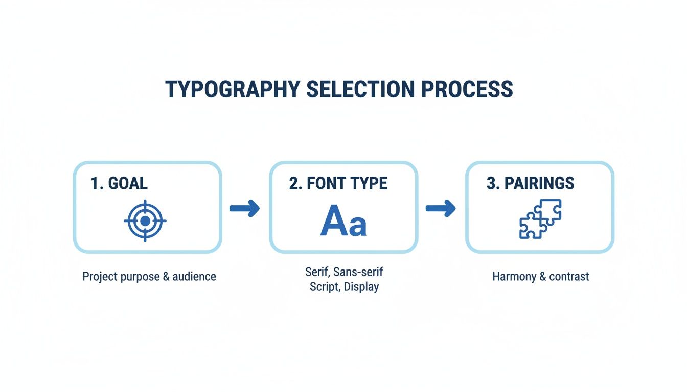
As you can see, choosing your typography is a deliberate process. It starts with your end goal and finishes with pairings that create harmony and make your text easy to read.
Creating and Modifying Styles
Most programs let you easily tweak existing styles or even build your own from scratch. This is very useful if you need to match specific brand guidelines or just have a personal preference.
You can set the font, size, color, spacing, and a whole lot more for each style level you create.
By creating a custom style set for your company reports or personal projects, you make sure every document you produce has a consistent, professional appearance. It is a one-time setup that pays off every time you start a new file.
Adding Professional Touches to Your Document
It is often the small details that make a document feel truly professional. Once you have got the core content down, spending a little time on the finishing touches—like headers, footers, and page numbers—adds a layer of polish that readers absolutely notice.
These elements are not just for looks; they are practical tools that help people navigate your work. A simple page number is a lifesaver in any multi-page report, while a good header can keep the document title or your name visible on every page.
Customizing Headers and Footers
Most word processors make adding headers and footers easy, but the real magic is in the customization options. You can easily tweak them to behave differently depending on where they are in the document.
- Different First Page: This is a classic move for title pages. You almost never want a header or page number cluttering up your cover.
- Odd & Even Pages: For longer reports or book-style documents, you can have headers that alternate. For example, you could put the main document title on the left (even pages) and the specific chapter title on the right (odd pages).
This kind of attention to detail sends a clear signal that you have put real thought and care into your work.
Here's a pro tip: Use the footer to track important info like the document title, creation date, or a version number. It's a simple way to keep revisions straight, especially if you're working on a team.
These formatting details are also necessary in academic writing and are crucial for proper citations. If you're pulling together a list of sources, our guide on how to make a works cited page breaks down exactly how to get your references in perfect order. Mastering these small but important features is what will make your document stand out.
Presenting Information Clearly With Tables and Timelines

Let’s be honest, sometimes a wall of text just does not work. When you're trying to show complex data, compare a few options, or explain a sequence of events, visual aids like tables and timelines are your best bet. They give the reader a much-needed break from dense paragraphs and serve up information in a way the brain can digest quickly.
Think about it: a well-made table can make complicated data crystal clear. It's the perfect tool for comparing product specs, laying out survey results, or assigning project roles. Instead of forcing your audience to hunt through sentences for the info they need, a table presents everything neatly in a grid.
Of course, your visuals are only as good as the text around them. Before you get fancy with charts and graphs, make sure the surrounding content is sharp. Advanced writing assistants can be a huge help here. For example, a tool like Word Spinner offers advanced rewriting that can turn clunky, technical jargon into a clear, natural-sounding narrative, ensuring your visuals have the engaging context they deserve.
Laying Out Information in Sequence
Timelines are another powerhouse, especially when you need to show a process or tell a story over a period of time. I find them very useful for mapping out project milestones, showing a company's history, or breaking down key historical events. A simple timeline can communicate a sequence way more effectively than a bulleted list or a long explanation.
The effect of using visuals like this is huge, especially since so many people are visual learners. In fact, adding a timeline infographic can boost information retention by a large amount compared to plain text alone. Project managers are big fans, too—many of them prefer timelines for their layouts, reporting that it dramatically cuts down on planning time. If you want to dive deeper, you can check out the full findings on timeline effectiveness to see just how powerful they are.
When you're formatting a document, always think about your reader's journey. Use tables to help them compare and contrast information, and use timelines to walk them through a series of events from start to finish.
Common Formatting Questions Answered
Even when you have a solid plan, formatting a document can throw a few curveballs your way. Let's tackle some of the most common issues people run into. These quick fixes will get you unstuck and back to writing.
What Is The Best Font Size For A Standard Document?
For your main body text, stick to a font size between 10 and 12 points. This is the sweet spot for readability in most professional and academic documents, making sure your reader does not have to squint.
Headings need to stand out. A larger size creates a clear visual roadmap for your reader. I usually aim for 16-18 points for the main title and 13-14 points for subheadings. The goal is to create an obvious order that guides the eye naturally through the content.
How Do I Fix Messed Up Formatting When I Paste Text?
We have all been there. You copy text from a website, paste it into your document, and suddenly your formatting is a disaster. The easiest way to avoid this is to use the 'Paste as Plain Text' or 'Keep Text Only' option.
This command is a lifesaver. It strips away all the old, unwanted styles and lets the new text adopt the formatting you have already established in your document. It is the key to maintaining a clean, consistent look.
Why Should I Use Styles Instead Of Just Making Text Bold?
Using your word processor's built-in styles—like 'Heading 1' and 'Heading 2'—is a huge plus for efficiency. Instead of manually formatting every single heading, you just apply the style.
Later on, if you decide you want to change how all your subheadings look, you just edit the style itself. Every instance updates on its own. This approach also lets your software create a clickable table of contents for you, which is a massive time-saver.
Speaking of structure, proper citations are just as critical in academic work. A well-formatted paper is often complemented by correctly formatted sources, which you can learn more about in our detailed citation format guide.
When your text needs more than just a formatting polish, Word Spinner is ready to help. Its rewriting tools can humanize your content for a natural tone, remove AI detection, and ensure your final document is completely unique and plagiarism-free.